People visit websites to learn more about products or services they need. It is essential to have a clean, engaging, and functional website design to attract more customers, boost brand consistency and generate revenue.
Web designing can take from two weeks to a few months, depending on various factors like the complexity of the features, type, and business requirement.
Want to create an eye-catching design to attract more leads? Let’s see what steps you should follow to make a good website design.
Step-by-Step Website Design
Websites’ design process steps are similar to the mobile app ones. However, there are some differences we want to emphasize. So, you’ll better understand the UX/UI process of creating a website.
Step 1. Make a Project Plan
How to create a good website design? Everything starts with the planning stage. Otherwise, you won’t understand what results you want to get in the end. The design plan will save you precise time and money.
- Before moving to the designing stage, you should examine the project’s requirement;
- After you need to analyze the website’s goals. Whether this website builds around sales or aims to customers attraction to the brand;
- Then, you should define the features for your website to figure out an overall design. Besides, ensure that the future website offers the audience precisely what they need and want;
This information will help you make an excellent website design and avoid potential mistakes and revisions.
Step 2. Research & Sketching
When you’ve finished with a planning stage, it’s time to proceed to the research stage. You can check out competitive websites to see how they’re built and what features are used there.
But remember, there’s no sense in creating even a good copy. People won’t use your product if there’s a solution that already satisfies their needs.
It’s better to study the competitors’ websites and decide what unique features you can add to stand out from the other ones. Start with a few sketches in the graphics editor to come up with more ideas and find your own web design direction.
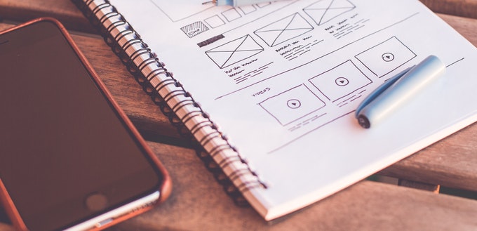
Step 3. Creating Wireframes

You need to build wireframes for visual structure. For instance, you can use Sketch editor to make the testing design of the future website. Wireframes are black and white since it is the basis of a website. There is no need to think of the colors at this stage.
You should create visible buttons, bars, and other elements that may be placed in a real website further. Thus, you’ll see how the website will look like in the future.
Moreover, wireframes of the website will help you understand information order on the homepage, what should be placed first, what should be put second. This is where you try to go through user experience and predict user behavior psychology.
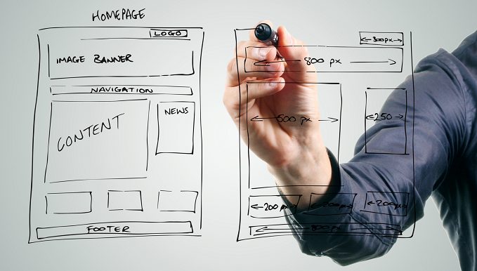
Step 4. Homepage Navigation and Layout Building
A homepage is the calling card of your website. It tells visitors what you offer them and what your website is about. So, it’s a crucial part of the web design workflow process. The homepage should be intuitive and easy to navigate.
As for the layout of a homepage, it is necessary to spread the information that will be placed above and below the fold.
- Above the fold – all the information put in this part is visible to users first. So, you should add here the most meaningful info for visitors. All upcoming offers and bonuses also should be placed at this point.
- Below the fold – here you put information about your brand, product, or service you provide. To get to this info, visitors need to scroll down the page.
If you want, you may put a logo above the fold to let users see it first when they enter your website. As for the navigation menu, almost all websites put the bar on the top of the page to let visitors easily navigate through the website. Usually, the menu bar directs users to About company, Services, Contacts, Testimonials, and others.
When you create a website design and develop the navigation, think of the visibility of each element, design short titles instead of long not to irritate users.
Besides, all links should have a specific title. Users don’t have time to figure out what you wanted to say. It’s better to keep the basic principles of website design to meet users’ expectations.
Step 5. Additional Website Elements Design
To provide users with a full-fledged website, you can enrich it with additional elements.
Animations. Add different animated objects to make your future website more appealing and vivid. It enhances user experience and strengthens loyalty towards the website from the customers.
Loaders. You can put a loader sign on the screen to make it more interesting for users while they’re waiting for page load.
Banners. The banners are a useful idea if you’re planning to build an ecommerce website. Banners are images that aim to catch customers’ attention with relevant advertising messages.
Hints. Hints simplify the user navigation through the website. It includes valuable information that shows up when users interact with the website. It’s beneficial when they enter the website for the first time and look for specific products, services, or information.
Step 6. Color Scheme and Typography

Research has shown that 90% of web users choose a website based on its color scheme. The color has a direct impact on customer decisions when they buy a product or select service.
That is why color schemes should be combined wisely during the website design process flow. For example, the color of the buttons should be complied with the website background and other elements. Keep in mind that certain colors affect users’ perceptions. Don’t use too many black and red shades as these colors make people angry.
It is better to select the color for each product personally since the whole color scheme depends on the website subjects.
Typography should match the color scheme otherwise, the website will turn into a font and color mess. Besides, it should be easy for users to read and understand the font. Be simple, don’t use extraordinary fonts. For instance, Times New Roman is a commonly used font in design practice.
Step 7. Providing Customer with Prototypes
And, finally, keep customers up to date. Send them the website’s prototypes to let them check the quality and the current condition of a website. They can add some remarks or ask for a revision. If everything is fine, hand over the website design to front-end and back-end developers.
Popular Web Design Tools

After you’ve mastered the steps to a good website design, let’s look at the web design tools you can use to transform your idea into reality.
-
InVision
It’s a cloud platform that lets you design mockups and prototypes of interfaces. You can share your work with a customer and developers, and it is possible to watch the whole process of UI and UX building. InVision is based on Agile methodology, so that you can divide tasks into sprints and versions.
-
Sketch
Sketch is a tool allowing you to create user interfaces on Mac OS. It makes it possible for designers to draw dozens of app screens simultaneously.
Moreover, it has a very well-designed interface, thoughtful interaction with styles, parameters of elements, and so on. Also, you can use the following Sketch plugins — Craft, Material, User Flows — they simplify and improve web design workflow and speed up the UI/IX building process.
-
Principle
Principle is a platform that lets you create animations and animated objects in the interface very fast. Moreover, you can design an interactive prototype and create multiple screens for animation.
-
After Effects
After Effect is an Adobe tool that allows you to edit video, dynamic images, animations, and design various effects. You can make animations for mobile apps and websites.
If you don’t create custom UI/UX design and you need to reshape already existing web design, you can utilize the following tools:
- Photoshop
- Illustrator
- Figma
- XD
Types of Website Design
Let’s talk about different types of website designs you can work with from time to time.
-
Adaptive Design
Adaptive web design will match perfectly any device, including tablet, smartphone, or laptop. As a result, users don’t need to expand their screens to click on the required link or button. Adaptive design is a costly decision, but it captivates more visitors and engages brand loyalty.
-
Responsive Design
Responsive design is a flexible web design that is modifying when it is used on various devices. Unlike adaptive design, responsive web design doesn’t adjust some elements, it stretches them. Both adaptive and responsive design are good options, the final choice will depend on the particularities of a website.
-
Bootstrap Grid
Bootstrap grid provides you a set of tools for designing websites and exclusive web applications. You can use this tool if you need to create mockups as quickly as possible without sacrificing quality.
-
Landing Page
It is a single-page website designed to satisfy a specific business goal, like attracting customers, downloading the e-book, registration for a webinar, and so on. Unlike a full-fledged website, the landing page doesn’t contain many advertising, buttons, and other design elements. It’s created quickly, and it is usually built as an add-on to the main website.
Wrapping Up
Surely, there is no limit for improvements. However, if you master the steps above, you’ll be able to turn your website design into a piece of art and get a competitive advantage.
Vitaly Kuprenko is a content manager at Cleveroad, a software development company in Ukraine. He’s written hundreds of articles about technology and innovations that helped the various-sized businesses to make the right decisions.